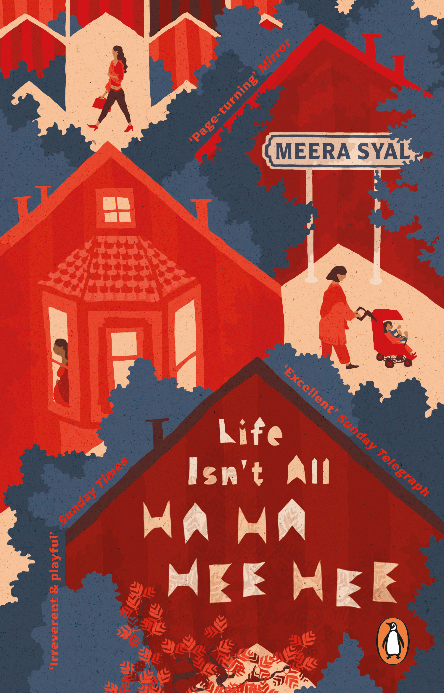
Book cover for Life Isn't All Ha Ha Hee Hee by Meera Syal
This book cover design for Meera Syal's Life Isn't All Ha Ha Hee Hee was awarded 3rd prize in the Penguin Random House Student Design Award 2021.
In my design, I combined a Punjabi embroidery pattern with London architecture by making the geometric elements of the pattern resemble rows of houses. This allowed me to reference both the area of London that the protagonists are from and the culture of the Indian diaspora that plays a central role in the novel. These two main references are supported on other levels like the colour palette referencing Punjabi textile or the author’s name stylized as a London street sign. My cover also reflects the general theme of domestic life and the life circumstances of the three protagonists.

Feedback on my cover design from the judges of the Penguin Random House Student Design Award:
‘This tells you all you need to know about the story straight away – literally windows into women’s lives but with real elegance and depth. Anna really gets the Punjabi textile feel in the colour palette and layering’ Meera Syal
‘There’s so much narrative and story on the cover – it’s a great snapshot of London, really makes you feel like you’re there – and it’s a fantastic illustration’ Jason Smith – Art Director, Cornerstone
‘This was one of my favourite entries from the start. I really love how it encapsulates the themes and the narrative within the book. It beautifully captures my experience of reading the book and the motif of windows reflects how I felt exploring the characters and protagonist. Brilliantly executed and original’ Greg Bunbury
‘The colours in this design are fantastic and I like the fact that it references Punjabi embroidery, colours and texture. Anna has a real eye for detail. I love the characters, the windows on the world and the way the quotes run along the edge of the houses – just beautiful’ Suzanne Dean – Creative Director, Vintage
‘Jumped out at me from the moment I saw it. It’s so original – I love the illustration style and the colours that have been used are beautiful. I particularly liked how the type has been integrated in the little street sign. It’s all been so well considered and sets the scene of the book’ Loulou Clark – Art Director, Ebury